BLUEPRINT: Chicago has MOVED
BLUEPRINT has MOVED!!! This site will no longer be updated, and soon will be no longer. BLUEPRINT can now be found NEW and IMPROVED at BLUEPRINTCHICAGO.ORG! Come take a look!
BLUEPRINT has moved!
blueprintchicago.wordpress.com will no longer be updated, and soon will disappear. BLUEPRINT can now be found NEW and IMPROVED at BLUEPRINTCHICAGO.ORG! Come take a look!
And as a little enticement of what the new site offers here’s a a hint of the latest post on the new BLUEPRINT . . .
GUEST BLOGGER: NOAH VAUGHN . . . .
Noah Vaughn is Chicago’s modern day Richard Nickel. An intrepid urban explorer, he documents vacant decaying buildings through stunning photographs. The following photographic essay will (hopefully) be the first in a series of entries written by guest bloggers who offer different perspectives on the field of architecture.
 A Last Look at 825-831 South Wabash
Noah Vaughn
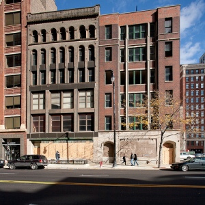
While Chicago’s building preservation community was wringing its hands over the impending demolition of the historic (but vacant and dilapidated) Johnson Publishing-owned YWCA building at 830 South Michigan Avenue, two other nearby buildings owned by Johnson were being torn down without much notice. Too bad, because while they didn’t have the historic pedigree of the YWCA building, they were noteworthy enough to merit a second look. . . . . READ MORE at BLUEPRINTCHICAGO.ORG!
Federal Center
Dearborn between Jackson and Adams
The son of a stonemason, it makes sense that Mies van der Rohe was once heard exclaiming, “Now a brick, that is something!” But Mies became famous not for his admiration of bricks, but his mastery over steel.
The steel and glass buildings of Federal Center are simple and frozen at first glance. The many people who stop engaging with the Federal buildings at this point label them as austere, cold or inhuman. But those who are lucky enough to keep looking, inevitably find that Mies’s steel structures are just the opposite. They pulse with energy. Repeating bars of steel piers, mullions, and I-beams form the buildings’ metronome. Panes of glass large and small allow the eye to rest. And then there is the constant movement of lights, reflections and people throughout the buildings and surrounding plaza. The combination is musical. And so, as Mies famously said, “Less is More.”
Federal Center is composed of three buildings – the 30-story Dirksen tower (combined office and courtroom building), 43-story Kluczynski tower (office building), and single-story post office – built over a sixteen-year period between 1959 and 1975. The buildings were built to replace the old domed 1905 Henry Ives Cobb federal building – dated in style even before its completion. While the classically designed Cobb building was almost imperial in its grandeur, Mies’s design is democratic. His buildings are perfectly transparent – fitting for a government that strives to convey a sense of openness. Also important for government buildings is to embody a sense of order – of which there is no shortage of in Mies’s design.
Imagine that the three buildings are sitting on a huge piece of graph paper divided into 4’8” squares – as seen in the lines forming the plaza’s pavement. The squares are the module that the rest of the buildings are similarly built on. Follow the lines. Every line of the pavement leads to the exact center of a key part of a building’s form – such as the pilotis, piers or mullions. The grid continues through the buildings (the same granite used in the plaza is also used inside the lobbies – only polished), and up the buildings – in a repetition of evenly spaced I-beams forming the center’s only ornamentation. The same grid even continues uninterrupted on the roof of the post office. What’s more? The height of the post office is the exact height of the lobbies of the two towers. It’s no surprise that Mies’s other commonly used saying was “God is in the details.”
The details combine to form a perfectly unified whole. Mies’s buildings soar up into the sky sleek and modern. They’re both heavy in how they’re made of velvety black painted steel, and weightless for how they float above the ground over big open glass spaces. Their minimal facades reflect the historic buildings surrounding them. Standing in the middle of it all is Alexander Calder’s flaming red Flamingo sculpture. It simultaneously ties everything together and sends it all into motion.
Federal Center was not the work of Mies alone. Though the initial designs were his own, he died in 1969 – six years before the completion of the center. Gene Summers and Bruno Conterato from Mies’s office with the help of associate architecture firms Schmidt, Gardin & Erikson, CF Murphy & Associates, and Epstien & Sons, together carried out Mies’s plan to completion.
And you might have noticed that there’s a lot of construction going on right now on the plaza of the Federal Center. To learn more about this stimulus project read this article.
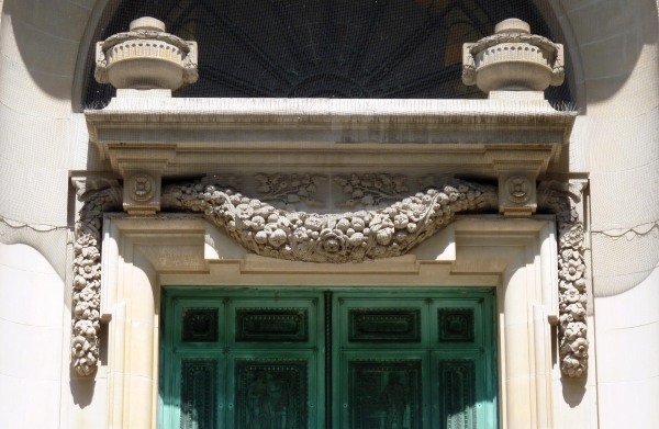
word of the week: FESTOON
The Presidential Towers
555 W. Madison St.
The story behind the Presidential Towers is not strictly about architecture. Instead, the four buildings tell a typical tale of Chicago politics — and all the greed, power and corruption you might expect from this city.
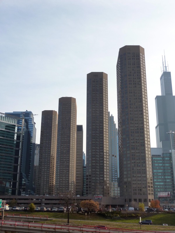
In the 1960’s the city demolished six blocks of low-income housing and single room occupancy hotels along Madison Street. 7,000 people were left without a home, to make room for five 90-story office towers that were never built. The land stood empty for years. Twenty years later, in 1986, came four 49-story luxury apartment buildings – one just like the other – called the Presidential Towers.
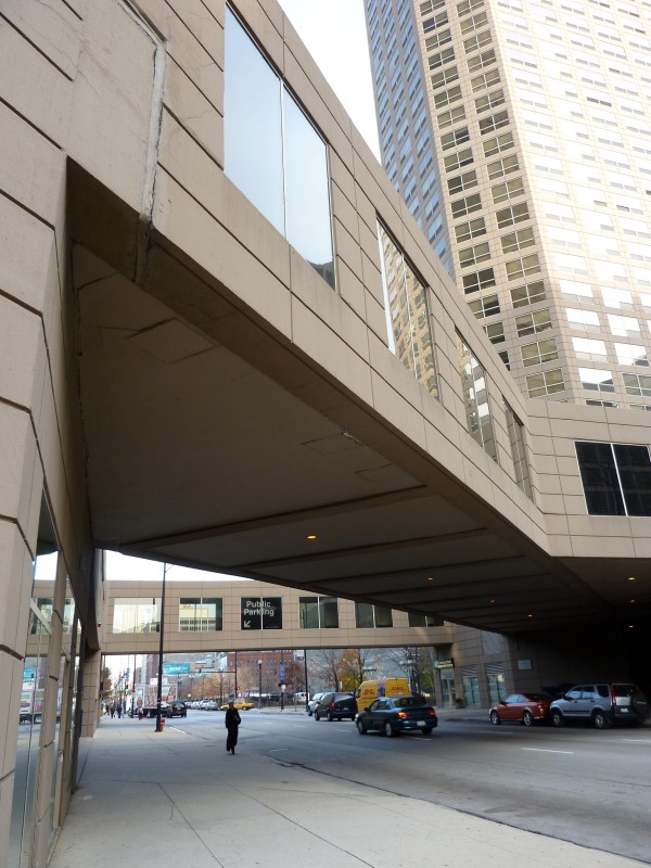
The buildings, just over the highway and next door to the Presidential Towers, offered a different reality. Housing projects, liquor stores, crime and people struggling to make ends meet was what defined the neighboring area. It’s no coincidence that the towers were built like a fortress. There’s a single entrance and security checkpoint for all four towers, and as you might expect it’s located in the tower closest to the safety of downtown. From there apartment dwellers take an escalator up to an elevated indoor pedestrian walkway connecting the buildings. Each tower is furthermore locked off from the other towers. What’s facing what was once the remainder of Skid Row? A barrier in the form of a large 3-story parking complex. The developers of the towers did everything they could to barricade the buildings from the surrounding neighborhood.
The buildings allowed apartment dwellers to further isolate themselves from the area by providing every imaginable amenity within the confines of the towers. The concept the architects of the Presidential Towers, Solomon, Cordwell, Buenz & Associates (SCB), had was to create an internal neighborhood within the complex. A supermarket, dry cleaners, floral shop, video rental store, and various restaurants were all contained within the buildings . . . not to mention an indoor swimming pool, exercise room, basketball court and running track. With so many conveniences within arms reach, there was little reason for those who lived in the Presidential Towers to ever leave the Presidential Towers.
The buildings were in great part made possible through hefty city and federal government subsidies. But thanks to Rep. Dan Rostenkowski (among others), the rules were bent so that the developers did not have to abide by the customary provision to set aside 20% of the apartments for low-income renters. Despite these favors, it wasn’t long before the development met with financial difficulties. In 1992 a $160 million bailout and refinancing of the Presidential Towers stipulated that 5% of the apartments would be allocated to lower income families. Today there are only a small handful of apartments reserved for low-income families. And it’s not surprising that now there are few signs of the urban blight that once marked the area. Instead, the West Loop is quickly growing to be one of Chicago’s hippest destinations.
Though the injustices represented by the Presidential Towers were once the source of public outrage, today their story is mostly forgotten. The protests ceased long ago and all that remains are the towers themselves. Though the general sentiment towards their design is as architecture critic Paul Gapp wrote, “banal by the most charitable description,” they’re still elegant in their own way. One after the other, they’re rhythmic. And when the sun is setting, sometimes they even seem to glow.
Many of the public amenities like the supermarket and flower shop left the Presidential Towers some time ago. But it looks as though construction has begun to bring many restaurants and other conveniences back to the Presidential Towers. To learn more about the towers remodeling or to learn more about life at the Presidential Towers visit their website.
The fight for equal housing opportunities is always present. One such struggle is found at the Lathrop Homes housing project. Recently announced were the plans to change the buildings from low-income into mixed-income housing. To learn more about the Lathrop Homes redevelopment plans read this.
333 W. Wacker
333 W. Wacker Drive
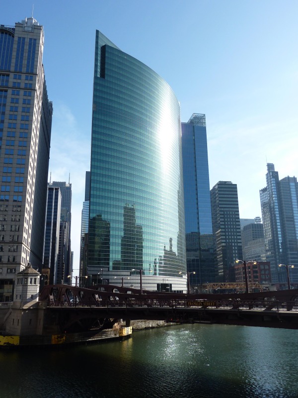
Located at the junction the Chicago River’s three branches, 333 W. Wacker is much more than just another skyscraper dotting Chicago’s skyline. It’s a tribute to the river below, sky above and buildings all around.
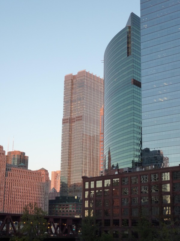
Sheathed in blue-green glass stretched taught across its curved façade, it appears to be an extension of the glistening green river below. It’s almost as if the river has risen into a wall over the city — like a frozen tsunami. Whereas the river stretches out wide, open and curved, the loop is quartered off and angular – the same is true of 333 W. Wacker. While the side of the building facing the river references the river in curve and color, the sides facing the city reference the city. 333 W. Wacker is shaped like a truncated triangle (or better yet, a piece of pie with a bite taken out of it). The loop facing sides of the building follow the hard lines of the surrounding structures and elevated tracks. 333 W. Wacker is textbook contextual architecture.
Contextualism is a key principle of postmodern architecture – a label that easily fits 333 W. Wacker. Completed in 1983, it was designed at the height of the postmodern period. Postmodernism was a reaction to the minimalism and severity of modernism. Suddenly architects were keenly aware of the relationships between their buildings and surrounding environments. 333 W. Wacker is the greatest example of this philosophy in Chicago. Notice how it even converses with the Merchandise Mart across the river. While the Mart is rectilinear, opaque and emphasizes its verticality, 333 W. Wacker is curvilinear, reflective and emphasizes its horizontality.
333 W. Wacker was designed by the New York based firm of Kohn Pedersen Fox. When built, it was rare to invite an outside architecture firm to design in Chicago – especially for such a prime location. They were also a small lesser-known firm, without a national reputation. However, the success of 333 W. Wacker put Kohn Pedersen Fox (KPF) on the map as reputable architects in Chicago and beyond. Today the firm is considered to be one of the greatest architecture teams for large-scale international building projects in the world.
KPF gained a reputation for smart design through 333 W. Wacker for more reasons than its aesthetic sensibilities. They were one of the first firms interested in sustainable building practices, seen foremost in their choice of glass cladding. KPF chose to use 6 acres (or 275,000ft) of Ford Motor Company’s special reflective architectural glass (at a cost of $1.2million). The glass had an inside coating of reflective metallic oxide film which blocks up to 65% of the sun. This allowed for cooling costs to be kept at a minimum during Chicago’s hot summer months. Another smart and not so obvious choice the architects made was to raise all of the offices above the elevated tracks that cut behind the building. Instead of putting offices on level with the roaring trains, large circular air intake and exhaust fans create unlikely decorations seen by curious train passengers.
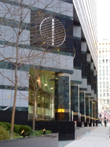 However few buildings go without any criticisms – and for 333 W. Wacker, the building’s river-facing base is a subject of controversy. Clad in lines of alternating heavy grey granite and green marble – the base seems disconnected from the crystalline façade above it. When architecture critic Paul Goldberger made a similar criticism, William Pedersen (chief architect on the project) rebutted by saying, “if the base matched the shaft, it wouldn’t be a base, would it?”
Whether or not it’s perfect, 333 W. Wacker has made it into Chicago’s architecture hall of fame. A timeless classic it will continue to be a favorite of many for years to come.
How can we be so sure it’s deserving of such praise? Kohn Pedersen and Fox were since asked to design the two buildings on either side of 333 W. Wacker (225 W. Wacker and 191 N. Wacker), not to mention countless more around the world. It was awarded the AIA National Honor Award in 1984. Check out KPF’s website here and their thoughts on 333 W. Wacker here. And Perkins + Will were the associate architects of the building. Here’s their website.
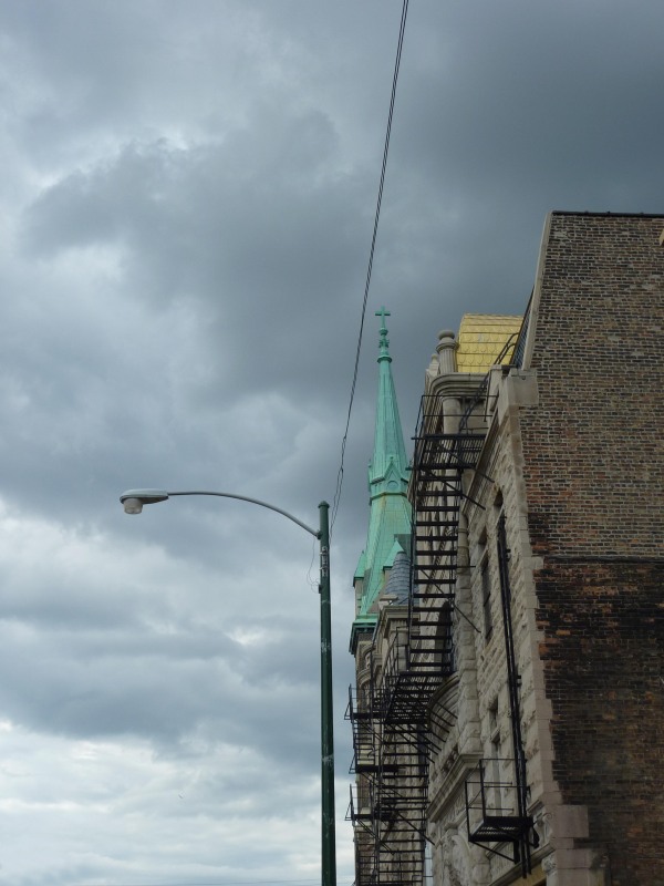
SKYLINES — Pilsen Clouds
word of the week: MULLION
MULLION: a vertical member dividing a window or other opening.
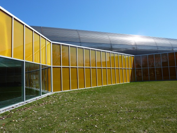
Notice that the mullions of the McCormick Tribune Campus Center are more than just the glue that holds the windows together. Instead they are also the piers that support the building, and the ornament that helps to visually define the building. One after another they give the building rhythm and make it almost musical.
SKYLINES — Happy Halloween!!!
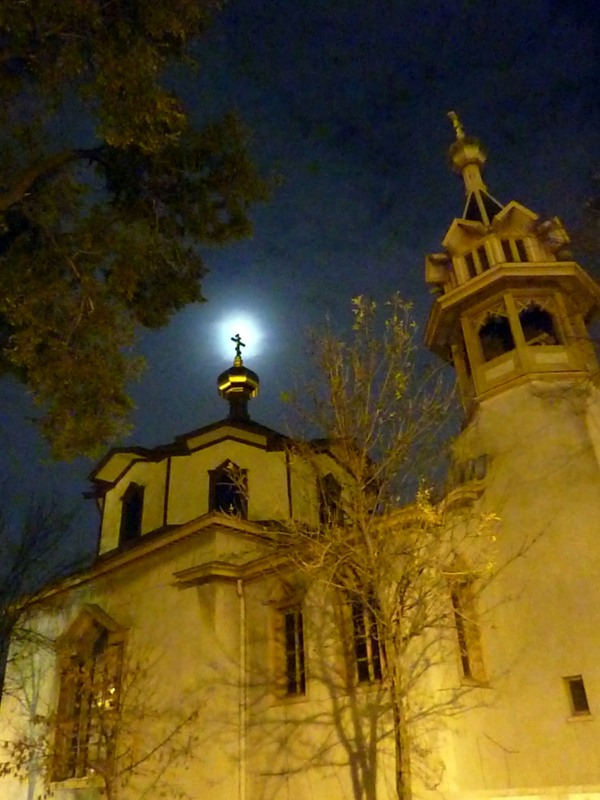
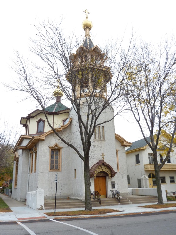
Holy Trinity Orthodox Cathedral
1121 N Leavitt St
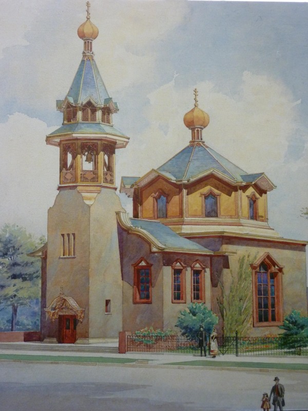
Eager eyes carefully search the Holy Trinity Orthodox Cathedral inside and out for any trace of architect Louis Sullivan’s distinctive touch of lavish nature-inspired ornament. Though other than in the canopy over the church’s entrance, his decorative work is hard to find and unusually restrained. It’s not what you’d expect from the architect. Holy Trinity is a delightful church: endearing in its size and playful in its shape. It’s no wonder why we love it. But why did Louis Sullivan love it?
Sullivan not only loved the building – he invested in it. He was so proud of his design that he returned half of his fee so that the church could afford completing his decorations. And he wrote of his hope that the church would become one of “the most unique and poetic buildings in the country.”
Plans for Holy Trinity began in the late 19th century as Chicago’s Russian Orthodox community was growing by leaps and bounds. They wanted a permanent church. This wish became a reality when Tsar Nicholas II provided the initial funds for building. The first designs commissioned by the church were by architect John Clifford. He designed a monumental church in keeping with the traditional Russian grand city cathedrals. However, the majority of this particular congregation did not come from the big cities. Most of Holy Trinity’s congregation came from small towns and farm country such as in Byelorussia, Ukraine and the Carpathian mountains. They found Clifford’s designs imposing. Understanding this (and being on a tight budget), Father Kochurov instead turned to Sullivan. Sullivan completed his design for the church in 1901, and the church itself was completed in 1903.
Though Holy Trinity is unlike any other church in Chicago, it would fit in well in Russia. Sullivan derived his design specifically from a small wooden church in Tatarskaya, Siberia (1897). Another major source of inspiration was likely the French critic Violet-le-duc’s popular book on the history of Russian architecture. Holy Trinity follows Le-Duc’s description of Russian church design as “elegance, not without boldness; the attentive study of the effect of the masses; a discreet ornamentation that is never powerful enough to destroy the principal lines and leaves repose for the eye.” A well balanced and bold but not overdone building, Holy Trinity is, in more ways than one, a traditional Russian Orthodox design.
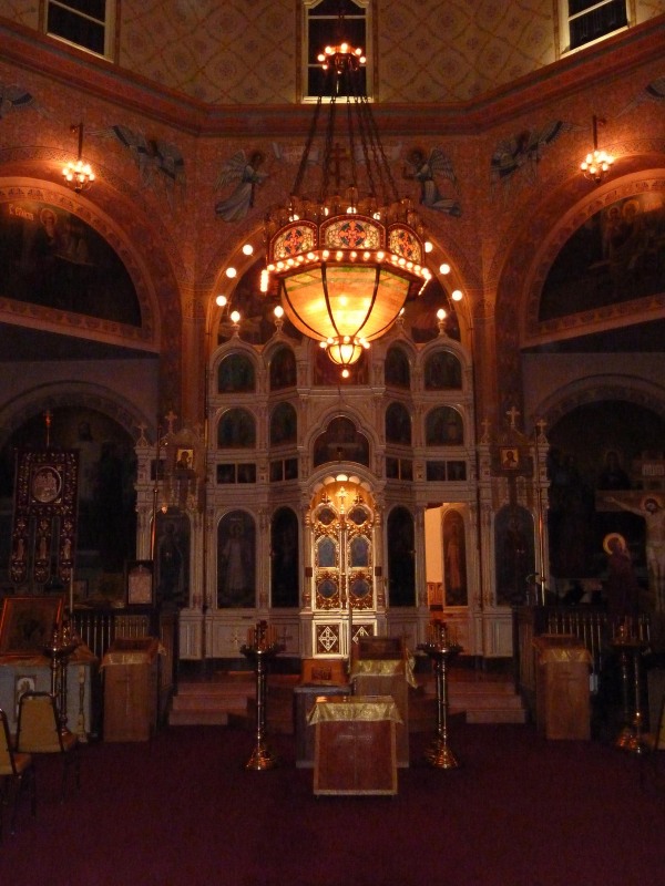
Just as little Sullivan ornament is found on the building’s interior as its exterior. A couple of exceptions are the stylized effect of a scattering of old light bulbs, and a stunning colored glass chandelier central to the sanctuary (though unconfirmed, rumors say the chandelier was designed by Louis Millet). The inside of the church is intricately and thoroughly covered in ecclesiastical paintings by Russian artist V. N. Vasnetoff. The centerpiece of the sanctuary is the iconostas depicting scenes from the life of Christ. It was brought from Russia and donated to the church in 1912.
Though many of us look hopefully for signs of Sullivan’s signature decorative touches in the church, it is oddly enough the lack of his ornament that makes Holy Trinity a perfect example of his design philosophy. He famously believed that “form follows function” in architecture. The function of this building was to serve as a religious center of Chicago’s Russian Orthodox community. His modern and peculiar ornament was irrelevant to the needs of this traditional group. Sullivan understood what was being asked of him and designed first – a church that fulfilled the needs of its congregation, and second – an elegant and harmonious structure appreciated by anyone lucky enough to cross its path.
Did you know that the church was originally painted in various bright colors ranging from red to ultramarine blue?
The Holy Trinity Orthodox Church was designated as a cathedral in 1923. For church Visitor Information click here. There are numerous Sullivan exhibitions, lectures and even films going on in Chicago currently. Visit BLUEPRINT: Chicago’s Calendar of Architectural Events for more information.
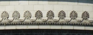
word of the week: ANTHEMION
ANTHEMION: an ornament of honeysuckle or palm leaves in a radiating cluster. It is also called honeysuckle ornament.
Anthemia (plural) are often found in groups. They might be seen in a group of three on the corners of a pediment or many more forming a line as pictured below on the Museum of Science and Industry. However on a small building in Pilsen (1443 W. 18th St.), one large anthemion sits proudly alone at the top of the building as the major focal point of the structure.
Aon Center
200 East Randolph Street
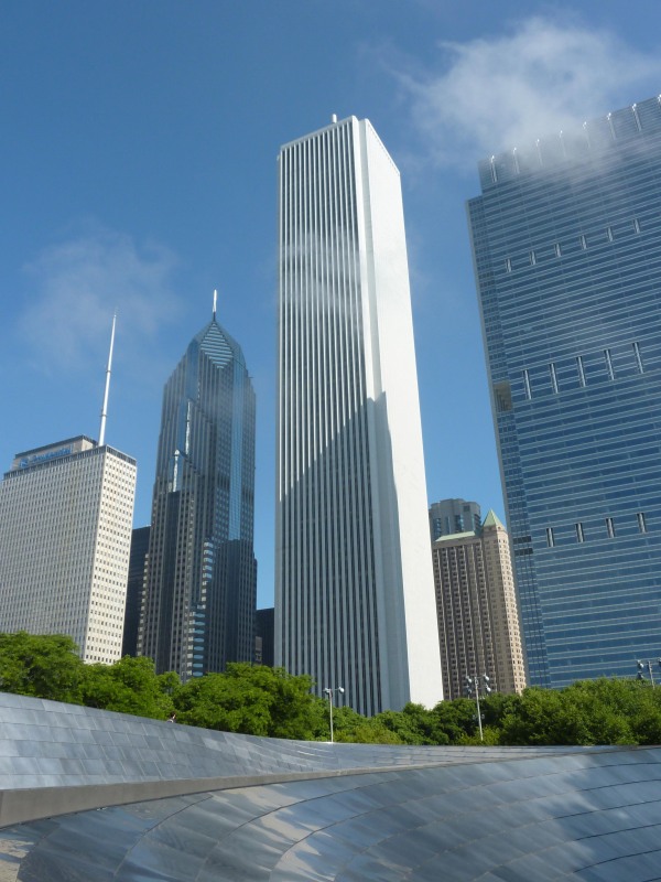
At a time when glass and steel buildings were the norm, architect Edward Durell Stone believed in masonry. He thought masonry buildings conveyed a feeling of strength and permanence that glass buildings did not. When he clad the Aon Building in marble, creating the tallest marble faced building in the world, he hailed the material as costing “no more than crumpled up aluminum.” If only that were really the case. Today the Aon Building is remembered as the biggest building blunder in Chicago history.
Completed in 1973, the tower was originally built for the Standard Oil Company (its name later changed to the Amoco Building and eventually Aon Center) to consolidate their twelve downtown offices into one central building to be shared with some of their major subsidiary companies. Standard Oil didn’t want just anyone designing their headquarters, and Stone had the reputation they were looking for. He was regarded as one of the country’s greatest living modernist architects, and was famous for designing such buildings as the Kennedy Center in Washington D.C., and the Museum of Modern Art in New York. Stone was charged with the building’s overall design, and the Chicago based architecture firm of Perkins + Will handled the structural design and details.
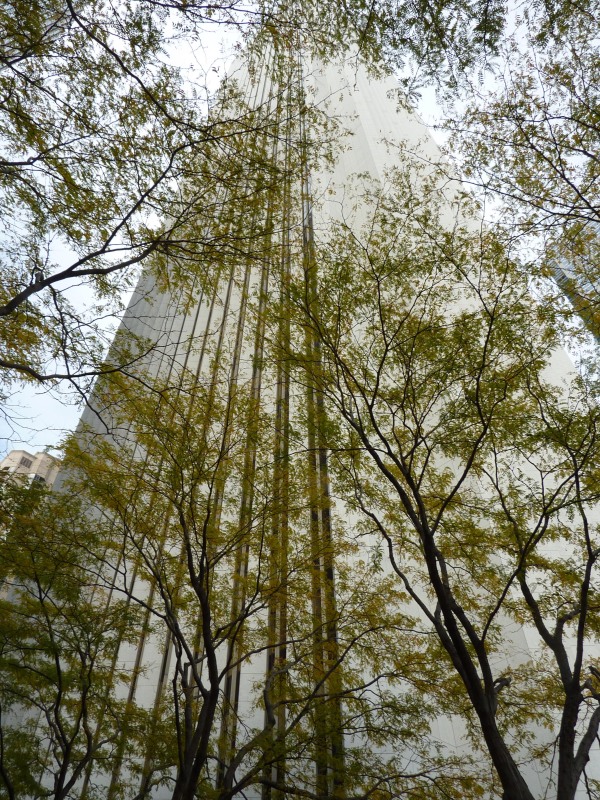
At 1136 ft. Stone was aiming for the Aon tower to be Chicago’s tallest building, but the Willis Tower took over that title before the Aon Building was completed. However, today it remains a defining skyscraper in our skyline as the third tallest building in Chicago (behind the Willis and Trump towers). Its structure is essentially a vertical square tube. The mechanicals (elevators, bathrooms etc.) are located in the central core of the building leaving the surrounding area on each of its 82 floors as clear unobstructed and workable space. Beneath each floor, trusses connect the core of the building to the many vertical piers that make up the tower’s four sides. This system allows for a column-free interior, but consequently a great number of piers are needed to support the weight of the building. That is why there is such a high stone to glass ratio in the Aon Building. That, and we can’t forget Stone’s love for, well, stone.
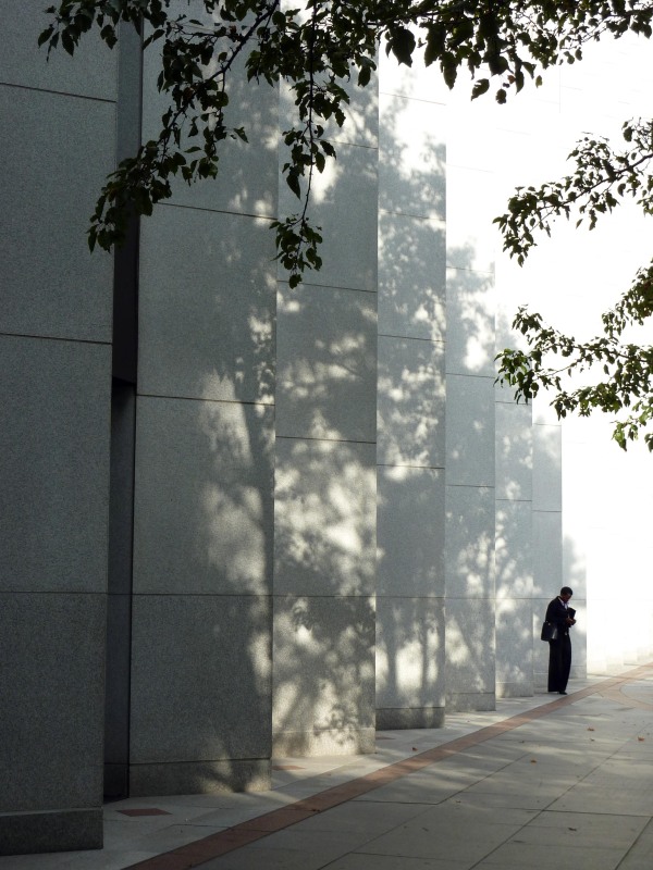
It’s simple in form, and its simplicity is what makes it so striking. Its massiveness and height give the building strength. Its vertical piers, one after another, give the building rhythm. From a distance there’s more to these vertical piers than what meets the eye – they’re triangular. And originally they were clad in Cararra marble (the same marble Michelangelo favored in his prized sculptures). But today it’s clad in white North Carolina granite.
What happened? Chicago’s weather happened. The marble was cut to an unprecedented width of only 1.25 inches. It didn’t take long to discover that the marble was cut too thin for Chicago’s extreme temperature changes. Heat causes permanent expansion in marble. While the exterior side of the marble was expanding, the side of the marble facing the building was not, and it began to bow. As it would eventually become a safety hazard, the marble was removed and replaced with granite 2 inches thick. The original cost of the building was $120 million. Replacing the stone cost somewhere between $60 and $80 million – more than half the building’s original price.
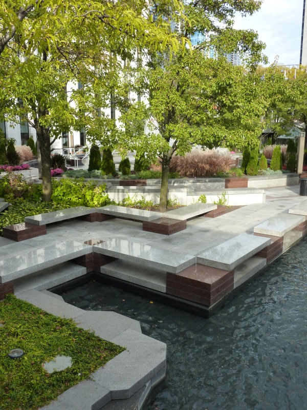
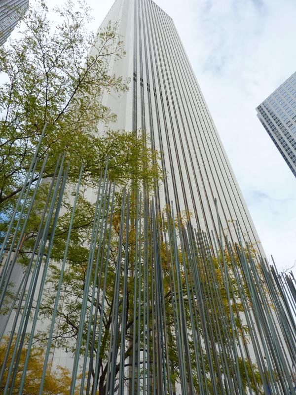
It still looks good though. In fact, today the Aon Building is one of Chicago’s greatest treasures, albeit underappreciated. The tower occupies only one-quarter of its entire lot. The rest is reserved for a grand bi-level plaza that doubles as a water park. Waterfalls and fountains cool the plaza. Rows of honey locust tress provide welcome shade on hot summer days and warm bright colors during the fall. Nestled in one corner of the plaza is Harry Bertoia’s “sounding sculpture” which sings in the wind. Made up of a series of thin metal rods, it mimics and puts music to the Aon Building’s soaring piers of stone.
Edward Durell Stone designed a number of noteworthy buildings in his lifetime. To take a tour of his architecture click here. And though Larry Perkins and Phillip Will are no longer around, their firm still is. Click here to visit the site of Perkins + Will.
To the left notice how the rods of Bertoia’s “Sound Sculpture” relate to the lines in the Aon Building. Click on the image to ENLARGE it!
